Beethoven 250

Illustration · Branding · Graphic Design
Introduction
Beethoven 250 is a conceptual branding project celebrating the 250th birth anniversary of Ludwig van Beethoven through a festival by the Vancouver Contemporary Orchestra. This self-initiated project explores how visual identity can embody the essence of a symphony—where diverse elements come together in harmony to create a cohesive experience.
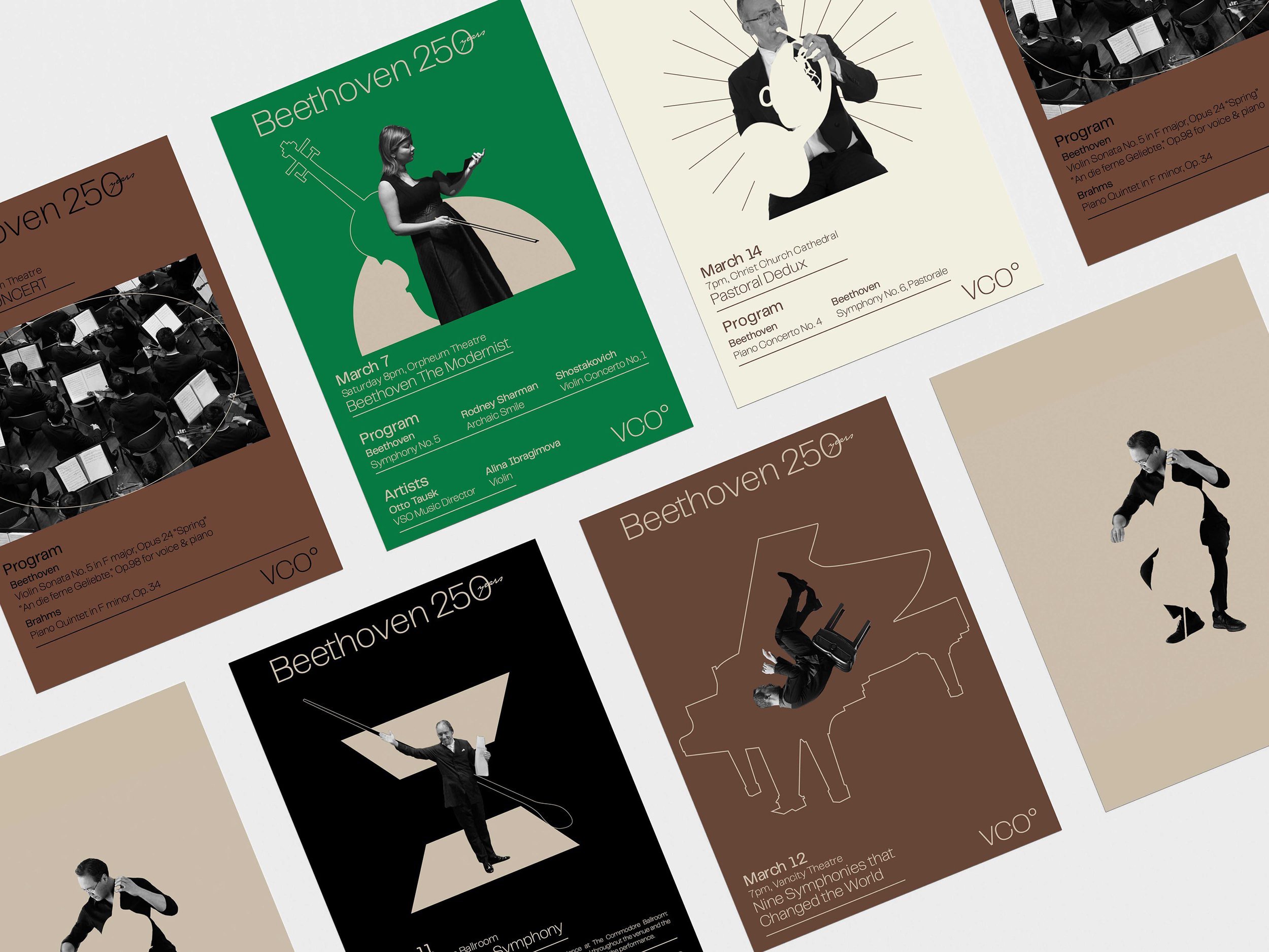
Drawing inspiration from the idea of negative space and collage art, I developed a modular brand identity system that reflects the layered, dynamic nature of Beethoven’s compositions. The shifting visual language is paired with a grotesque typographic set and a bold, expressive color palette—echoing the energy and emotion of the music itself. This design system aims to visually translate the grandeur of a symphony into an immersive and memorable experience.
Identity System:
The branding’s graphic language builds on a dynamic interplay of addition, substitution, and borrowed elements—creating a cohesive aesthetic that bridges contemporary and classical influences. This modular system reflects the essence of an orchestra, where individual components unite in harmony to perform a symphony.


32 Spread exhibition publication in 8x11size; Paper: Super white 80lb card stock - perfect bound


Set of Collages created after the Festival


